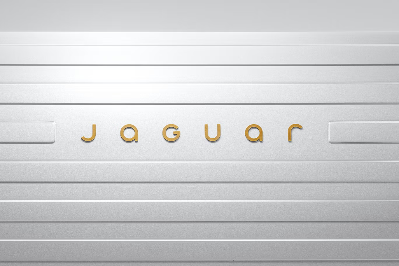
Jaguar’s rebranding “mistake”… and how you could avoid it...


Brands use multiple visual and audible triggers to represent their image. McDonald's is a prime example, you know those golden arches a mile off, but similarly you only need to hear the whistled tune of "I'm lovin’ it” to picture the company in your head instantly.
Some of the best logo rebrands are ones which understand their audience, but also understand and respect their legacy. Some rebrands may be so slight as to call them a revamp, some may be almost unrecognisable because a companies; product, motive, and audiences can change over time. What does this have to do with cars or Jaguar, well car companies are well known for their logos, their badges. I would argue for a car manufacturer the logo piece holds far more weight in their branding arsenal than other companies. With a car, the styles change, the colours are all over the spectrum, and we do not, as a norm, witness a lot of their branding style, unless we see an ad as showrooms are usually minimalist to help draw attention to the cars, and how often in our daily lives to we browse a Car Showroom? Another reason car companies are good to look at in this situation is their heritage. Some of these companies have been around since the birth of the motor car with companies like Ford evolving their identity over time.
We can see in Fords logo evolution for example that the logo has changed a lot, from a hand drawn signature style logo, to the modern badge we know today, however the feeling is still there, the text still holds that handwritten style. Jaguar’s rebrand on the other hand is very different. The new logo has lost the iconic Jaguar symbol from the main logo, and the text has changed from all uppercase to a hybrid of both written as JaGUar, the type keeps a legibility but loses the strength that it once had. When I first saw this I assumed they were trying to capitalise on the new wave of EV enthusiasm, which in fairness, they are as they announce an electric-only Jaguar.
The new jaguar icon, on the other hand, I love. It has an elegant style, its punchy, and I can see it in filigree inlay on a car bonnet from the 50s as much as I can see it glow and represent their electric future. It’s a shame this has taken a back seat in the launch and an even bigger shame it has been separated from the full logo, will this change, possibly? Will they work together, hard to say, the rounded nature of their new type may clash with the straight lines of the icon.
So in the bid to “reinvent” themselves Jaguar have thrown away a lot of history, not their own, but the car industry. Their new “electrified” logo type could just as easily be a new fancy LG smart fridge as it could be a millennial aesthetics boutique. In a normal case I would say to avoid this kind of loss of identity, keep your audience as core, honour your history, and make sure your logo tells us what you do, now. Jaguar’s falls short in this, but in all fairness their aim was to put a hard separation between the Jaguar of the past and the Jaguar we will be seeing in their new release of cars. Jaguar Land Rover (JLR) chief creative officer Gerry McGovern said Jaguar had "its roots in originality" and its founder, Sir William Lyons, believed it "should be a copy of nothing."
Does it succeed? Was a hard break good for the company? Only time will tell.